Lesson 24: Creating Charts and Graphs in Excel VBA
Continue learning classic Excel VBA with the same shared lesson template and cleaner visual style.
Learn how to automate chart creation and customization using Excel VBA
Introduction to Excel VBA Charting
Excel VBA provides powerful tools to create and customize charts programmatically. Whether you need to generate reports, visualize data trends, or create dashboards, VBA can automate these processes saving you countless hours of manual work.
In Excel VBA, we can write code to create charts and graphs easily based on spreadsheet data. Excel's charting engine is part of the Shape object and is also an object itself. We can create charts on their own sheets or embed them into existing worksheets. Chart sheets are Chart objects while embedded charts are part of the worksheet's shape collection.
Key Benefits of VBA Charting:
- Automate repetitive chart creation tasks
- Standardize chart formatting across reports
- Create dynamic charts that update with data changes
- Build interactive dashboards with VBA controls
- Generate complex chart combinations not easily created manually
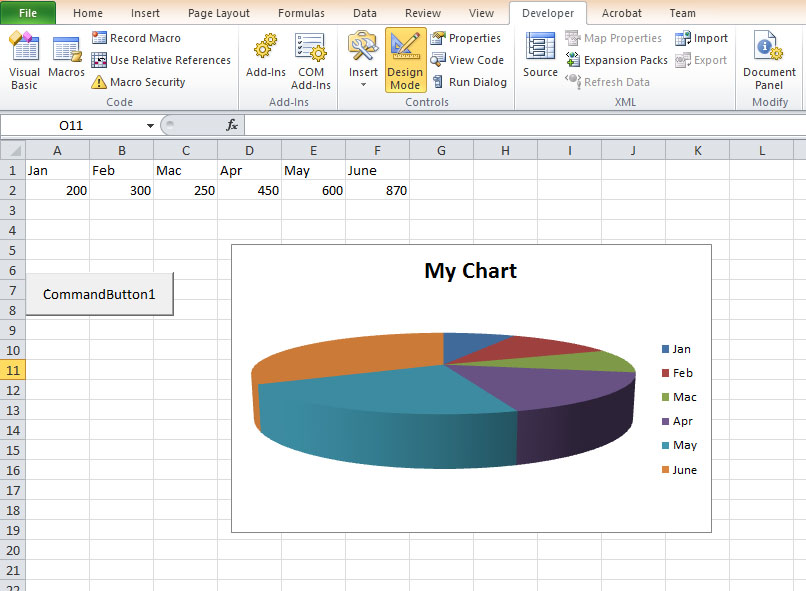
24.1 Creating a Pie Chart with VBA
Pie charts are excellent for showing proportions and percentages. Let's walk through creating a 3D pie chart with VBA.
Step-by-Step Guide:
- Enter your data in a worksheet (e.g., A1:B6 with categories and values)
- Name the data range (Right-click → Define Name → "MyChart")
- Insert a command button from the Developer tab
- Add the following VBA code to the button's click event:
Private Sub CommandButton1_Click()
    'Create and position the chart
    ActiveSheet.Shapes.AddChart.Select
    ActiveSheet.Shapes(1).Top = 10
    ActiveSheet.Shapes(1).Left = 10

    'Set chart type and data source
    ActiveChart.ChartType = xl3DPie
    ActiveChart.PlotArea.Select
    ActiveChart.SetSourceData Source:=Range("MyChart")

    'Add and format chart title
    ActiveChart.HasTitle = True
    ActiveChart.ChartTitle.Text = "Sales Distribution"
    ActiveChart.ChartTitle.Font.Size = 14
    ActiveChart.ChartTitle.Font.Bold = True

    'Format data labels
    ActiveChart.ApplyDataLabels
    ActiveChart.SeriesCollection(1).DataLabels.ShowPercentage = True
    ActiveChart.SeriesCollection(1).DataLabels.ShowCategoryName = True
End Sub
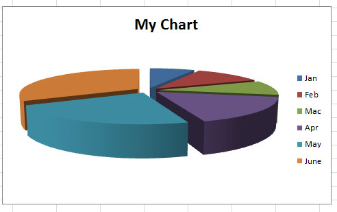
Exploding Pie Slices
To emphasize specific segments, you can "explode" the pie chart by separating slices. Add this line to your code:
ActiveChart.SeriesCollection(1).Explosion = 10
This will separate all slices equally. To explode just one slice, you would need to access individual data points.
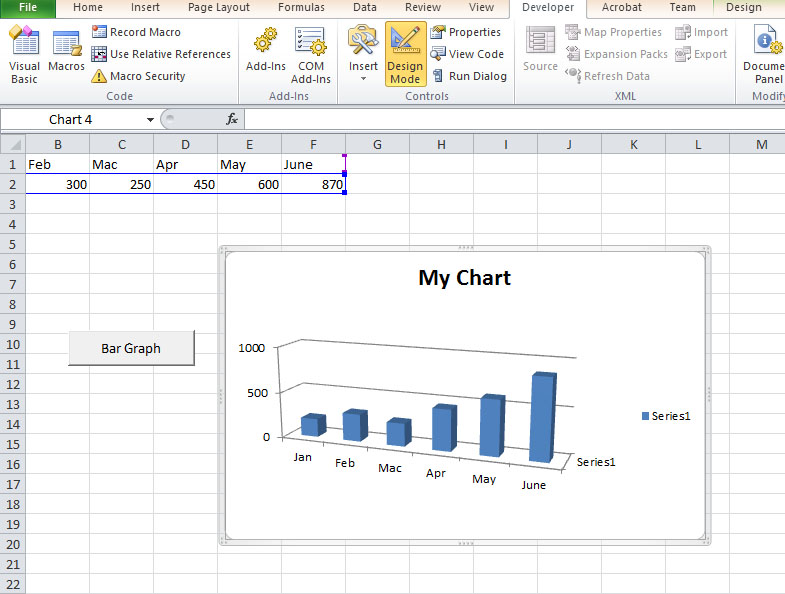
24.2 Creating a Bar/Column Graph
Bar graphs (or column charts) are ideal for comparing values across categories. Here's how to create one with VBA:
Private Sub CommandButton2_Click()
    'Create and position the chart
    ActiveSheet.Shapes.AddChart.Select
    ActiveSheet.Shapes(1).Top = 10
    ActiveSheet.Shapes(1).Left = 10

    'Set chart type and data source
    ActiveChart.ChartType = xl3DColumn
    ActiveChart.PlotArea.Select
    ActiveChart.SetSourceData Source:=Range("MyChart")

    'Add and format chart title
    ActiveChart.HasTitle = True
    ActiveChart.ChartTitle.Text = "Quarterly Sales"

    'Format axes
    ActiveChart.Axes(xlCategory).HasTitle = True
    ActiveChart.Axes(xlCategory).AxisTitle.Text = "Products"
    ActiveChart.Axes(xlValue).HasTitle = True
    ActiveChart.Axes(xlValue).AxisTitle.Text = "Sales (USD)"

    'Add data labels
    ActiveChart.SeriesCollection(1).ApplyDataLabels
End Sub
24.3 Excel VBA Chart Types
Excel VBA supports numerous chart types through the ChartType property. Here's a comprehensive reference table:
| Property | Chart Type | Best For |
|---|---|---|
| xlArea | Area Chart | Displaying magnitude changes over time |
| xlBar | Bar Chart | Comparing values across categories |
| xlColumn | Column Chart | Similar to bar but vertical orientation |
| xlLine | Line Chart | Showing trends over time |
| xlPie | Pie Chart | Displaying proportions/percentages |
| xlXYScatter | Scatter Plot | Showing relationships between variables |
| xl3DArea | 3D Area Chart | Area chart with depth perspective |
| xl3DBar | 3D Bar Chart | Bar chart with depth perspective |
| xl3DColumn | 3D Column Chart | Column chart with depth perspective |
| xl3DLine | 3D Line Chart | Line chart with depth perspective |
| xlBubble | Bubble Chart | Displaying three dimensions of data |
| xlRadar | Radar Chart | Comparing multiple quantitative variables |
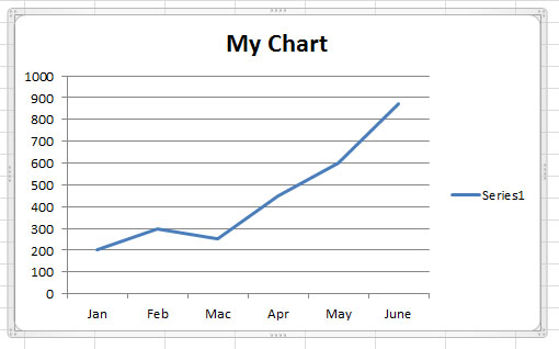
24.4 Creating a Line Chart
Line charts are perfect for showing trends over time. Here's how to create one:
Private Sub CreateLineChart()
    Dim chrt As ChartObject

    'Create chart object
    Set chrt = ActiveSheet.ChartObjects.Add(Left:=100, Width:=375, Top:=75, Height:=225)

    'Set chart properties
    With chrt.Chart
        .ChartType = xlLine
        .SetSourceData Source:=Range("MyTimeSeriesData")
        .HasTitle = True
        .ChartTitle.Text = "Monthly Sales Trend"

        'Format axes
        .Axes(xlCategory).HasTitle = True
        .Axes(xlCategory).AxisTitle.Text = "Months"
        .Axes(xlValue).HasTitle = True
        .Axes(xlValue).AxisTitle.Text = "Revenue"

        'Format series
        With .SeriesCollection(1)
            .Border.Color = RGB(0, 112, 192)
            .Border.Weight = xlMedium
            .MarkerStyle = xlMarkerStyleCircle
            .MarkerSize = 7
        End With
    End With
End Sub
24.5 Advanced Charting Techniques
Combination Charts
Create charts with multiple chart types (e.g., column + line):
Sub CreateCombinationChart()
    Dim cht As Chart
    Set cht = Charts.Add

    With cht
        .ChartType = xlColumnClustered
        .SetSourceData Source:=Range("A1:C6")
        .SeriesCollection(2).ChartType = xlLine
        .SeriesCollection(2).AxisGroup = 2
        .HasTitle = True
        .ChartTitle.Text = "Sales vs. Target"
    End With
End Sub
Dynamic Chart Ranges
Make charts automatically adjust to changing data ranges:
Sub DynamicRangeChart()
    Dim LastRow As Long
    Dim rng As Range

    'Find last row with data
    LastRow = Cells(Rows.Count, 1).End(xlUp).Row

    'Define dynamic range
    Set rng = Range("A1:B" & LastRow)

    'Create chart
    With ActiveSheet.ChartObjects.Add(Left:=100, Width:=375, Top:=75, Height:=225).Chart
        .ChartType = xlColumnClustered
        .SetSourceData Source:=rng
    End With
End Sub
Summary: Key Points
- Chart Creation: Use
Shapes.AddChartorChartObjects.Addto create charts - Chart Types: Set with
ChartTypeproperty (xlPie, xlColumn, xlLine, etc.) - Data Source: Specify with
SetSourceDatamethod - Formatting: Customize titles, axes, series, and data labels through VBA properties
- Advanced Features: Create combination charts, dynamic ranges, and interactive elements
- Best Practice: Use named ranges for more maintainable code
- Performance: For multiple charts, consider turning off screen updating during execution
🔗 Related Resources
Practice Exercise:
Create a macro that generates a dashboard with:
- A pie chart showing product category distribution
- A column chart showing monthly sales
- A line chart showing sales trends
- All charts properly formatted with titles and labels